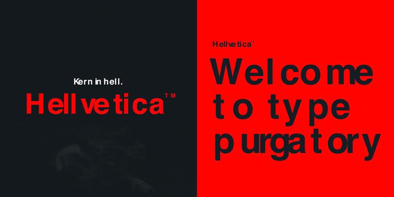
Typography is more than just the arrangement of letters on a page — it is a language of visual emotion. Few typefaces have shaped modern design as profoundly as Helvetica, the clean and timeless font that symbolizes clarity and neutrality. But in a world where rebellion fuels creativity, designers began to seek something darker, grittier, and more expressive. Enter Hellvetica, the twisted counterpart of Helvetica — a typeface that dares to descend into the shadows of design.
Hellvetica is not just a font; it is a statement. It reflects frustration, irony, and a pushback against the overuse of Helvetica in corporate branding and minimalist design. In this article, we will explore the story of Hellvetica, its cultural impact, and why it continues to captivate designers who aren’t afraid to embrace the chaos.
The Rise of Helvetica
To understand Hellvetica, we must first appreciate the legacy of Helvetica. Created in 1957 by Swiss designers Max Miedinger and Eduard Hoffmann, Helvetica became a symbol of modernity and precision. Its balanced proportions and neutral design made it the go-to font for brands, governments, and designers across the world.
From New York subway signs to global corporate logos like BMW, Panasonic, and American Airlines, Helvetica became synonymous with trust and professionalism. However, with widespread adoption came fatigue. As Helvetica’s dominance grew, so did the desire among designers to challenge its perfection.
The Birth of Hellvetica
Hellvetica emerged as a satirical response to Helvetica’s ubiquity. Created by designers who wanted to poke fun at the “perfect” font, Hellvetica intentionally breaks all the rules of typography. Letters are misaligned, kerning is inconsistent, and visual harmony is replaced with deliberate chaos.
What began as a joke quickly evolved into a cultural phenomenon. Designers started using Hellvetica to express rebellion against the corporate aesthetic and the notion that minimalism equals quality. The name itself — “Hellvetica” — captures its essence: a descent into the darker, more expressive side of typography.
The Concept Behind the Chaos
Hellvetica challenges the idea that good design must always be clean and controlled. It thrives on imperfection. Where Helvetica strives for neutrality, Hellvetica embraces emotion. It captures the frustration of creative minds tired of sterile design trends and polished brand identities.
Every letter in Hellvetica seems to scream for individuality. The uneven spacing and rough edges mirror the unpredictable nature of human creativity. It is the visual equivalent of punk music in the world of typography — loud, defiant, and unapologetic.
Why Designers Fell in Love with Hellvetica
For many designers, Hellvetica represents freedom. In an industry where rules, grids, and guidelines often restrict creativity, Hellvetica offers a break from conformity. It allows designers to experiment, to provoke, and to tell stories that don’t fit within the boundaries of corporate perfection.
The use of Hellvetica is not about readability or commercial appeal — it’s about emotion and attitude. Whether in posters, album covers, or digital art, Hellvetica stands out because it refuses to blend in. It reminds audiences that design is not only about beauty but also about expression.
The Symbolism of Darkness in Design
Darkness in art and design has always been a powerful metaphor. It represents mystery, rebellion, and the unknown. Hellvetica embodies this darkness not through color, but through its form. The jagged lines, uneven letters, and chaotic spacing reflect the darker side of creativity — the part that is often hidden behind polished presentations.
By embracing imperfection, Hellvetica celebrates authenticity. It reminds designers that beauty can exist in disorder, and meaning can be found in chaos. This symbolic darkness gives Hellvetica its emotional depth, setting it apart from the sterile perfection of Helvetica.
Hellvetica in Popular Culture
As the concept gained popularity, Hellvetica began to appear in various corners of pop culture. Graphic designers, musicians, and artists adopted it as a symbol of rebellion. It has been used in parody ads, experimental posters, and digital art projects that challenge mainstream aesthetics.
Social media platforms played a significant role in spreading Hellvetica’s fame. Memes and design jokes featuring the font circulated widely, making it an icon of creative resistance. It became a humorous yet powerful critique of design uniformity — a way to say, “we’ve had enough of perfection.”
The Psychology Behind Hellvetica
Typography influences how people feel about a message. Helvetica’s clean lines make it appear trustworthy and objective, while Hellvetica’s chaotic form triggers emotional reactions. It creates tension, discomfort, and intrigue — emotions rarely associated with typefaces.
Psychologically, Hellvetica speaks to those who value authenticity over approval. It appeals to designers who are tired of design trends that prioritize safety and simplicity over innovation. By breaking the rules, Hellvetica encourages audiences to think differently about what makes design meaningful.
The Artistic Value of Imperfection
In design, perfection is often seen as the ultimate goal. However, Hellvetica flips this concept on its head. It finds artistic value in what others might consider mistakes. Misalignment becomes intentional, uneven kerning becomes expressive, and distorted proportions become personality.
This philosophy connects Hellvetica to larger artistic movements such as Dadaism and abstract expressionism — both of which rejected traditional standards of beauty. By embracing imperfection, Hellvetica becomes more than a font; it becomes an art form that celebrates raw creativity.
Hellvetica and the Future of Design
As digital culture continues to evolve, so does the role of typography. Modern design is increasingly influenced by emotional storytelling and cultural expression rather than strict rules. In this new landscape, Hellvetica feels more relevant than ever.
Designers are no longer afraid to experiment. The success of Hellvetica reflects a broader shift toward authenticity, individuality, and experimentation in visual communication. Future trends will likely continue to embrace this balance between order and chaos — a harmony that Hellvetica helped bring to the spotlight.
Lessons from the Dark Side of Typography
Hellvetica teaches designers an important lesson: breaking rules can lead to innovation. While traditional typography emphasizes structure and clarity, Hellvetica shows that disruption can be just as powerful. It encourages creators to think beyond aesthetics and focus on the emotions their designs evoke.
In a world obsessed with perfection, Hellvetica reminds us that imperfection can be beautiful. It challenges designers to embrace their creative flaws, push boundaries, and express themselves freely. That is what makes it timeless — not because it conforms, but because it rebels.
Conclusion
Hellvetica is more than a typeface; it is a cultural statement. Born from satire, it evolved into a symbol of creative rebellion. It challenges the dominance of Helvetica and reminds us that design is not just about precision but also about passion.
By taking typography to the dark side, Hellvetica invites designers to explore the emotional depths of imperfection. It celebrates individuality, questions conformity, and inspires a new generation of creatives to find beauty in the broken. In the end, Hellvetica is not the opposite of Helvetica — it is its shadow, the reflection of what happens when art refuses to stay inside the lines.
FAQs
1. What is Hellvetica?
Hellvetica is a parody or alternative version of the classic Helvetica font. It intentionally distorts letterforms, spacing, and proportions to create a chaotic and expressive visual style that challenges design norms.
2. Why was Hellvetica created?
Hellvetica was created as a humorous critique of Helvetica’s overuse in corporate and minimalist design. It represents a rebellion against the perfection and uniformity associated with modern branding.
3. Is Hellvetica an official typeface?
While there are downloadable versions of Hellvetica, it began as a conceptual and satirical design. Some designers have created their own versions for artistic or experimental use.
4. How is Hellvetica used in design?
Designers use Hellvetica for posters, album covers, and digital art projects where they want to evoke emotion, rebellion, or humor. It’s not meant for readability but for visual impact.
5. What can designers learn from Hellvetica?
Hellvetica teaches that imperfection can be powerful. It encourages designers to take creative risks, embrace experimentation, and challenge the idea that good design must always be clean and controlled.
Also read: Galactic Cannabis | Premium Dispensary & Space-Themed Strains


